Charity website and childcare subsidy hub for Early Years
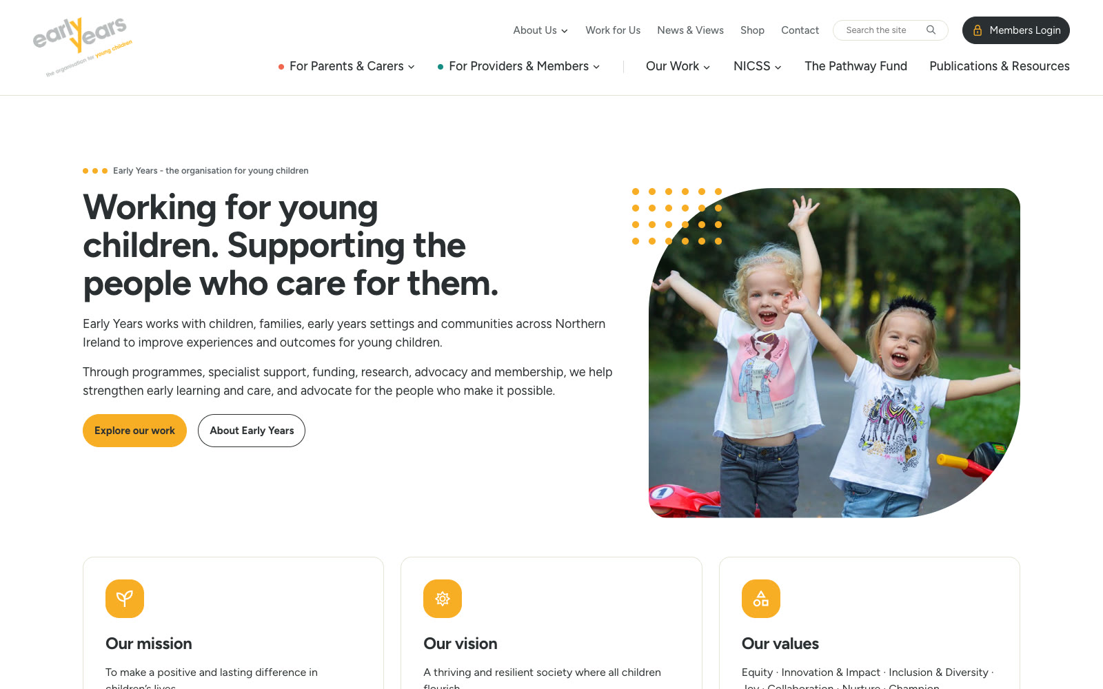
A new website for Early Years, the organisation for young children in Northern Ireland since 1965. It sends parents and the people who work with young children down their own routes from the first click, gives the Northern Ireland Childcare Subsidy Scheme a section of its own, and lets the Early Years team build every page from one set of blocks.

Early Years in numbers
The challenge: two audiences, one front door
Early Years works for parents and for the people who look after their children. The old site spoke to both at once.
Early Years started in 1965 as the Northern Ireland Pre-school Playgroups Association. Sixty years on it runs programmes, specialist support, research, advocacy and a membership for early years settings across Northern Ireland.
It also administers two schemes for the Department of Education. The Northern Ireland Childcare Subsidy Scheme takes 15% off registered childcare for eligible working families, and The Pathway Fund gives grants of £500 to £40,000 to childcare providers and childminders. Each brings its own audience, its own questions and its own deadlines.
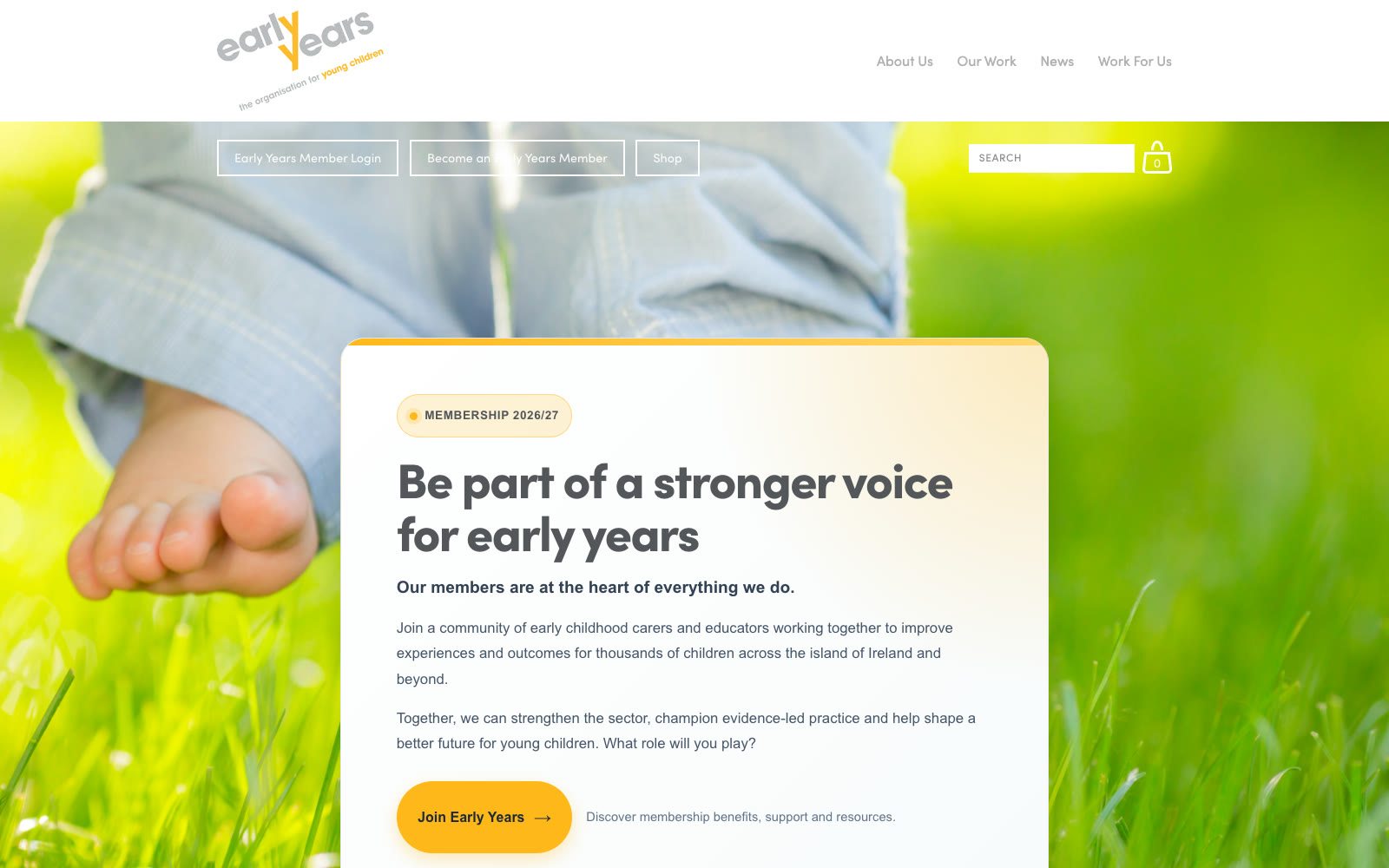
The old homepage opened with a membership pitch, with the subsidy scheme, the programmes and the news stacked underneath. There was no obvious place for a parent to start, and nothing to tell them which parts were written for them.
Our approach: ask who is visiting
A parent or carer, or someone who works with young children? The site asks early, and colours everything after that answer.
The main menu opens with two audience menus, For Parents & Carers and For Providers & Members, each ending in a link to everything for that audience. Parents are coral, providers teal and partners purple, and those colours mark the cards, tags and filters across the site, so a visitor can tell at a glance whether something is meant for them.
The childcare subsidy scheme has its own section in its own colours, lilac, rose and sage, with a hub and separate pages for parents and for providers. Each opens with the scheme’s explainer video, the portal one click away and the figures people are looking for, like 15% off and up to £203 per child each month.
Everything else is kept calm: cream and white sections, with amber saved for anything you can press.
The site was a collaboration with Whitenoise, who wrote the copy and curated the content while we designed and built it. They also work with Early Years on their graphic and print design.

What we built for Early Years
A site that knows who it is talking to, and a set of blocks that lets the Early Years team keep it current.
Two routes from the homepage
Straight after the introduction, “How can we help?” offers two doors: I’m a parent or carer, and I work with young children. Each has its own quick links. The Our Work hub lists all eleven programmes and services with audience filters that change the list in place.
A home for the childcare subsidy scheme
A hub, a page for parents and a page for providers. Parents get a five-step guide to registering, providers can register their interest online, and information sessions come off the page once they have started. Every one of the scheme’s 47 FAQ answers has its own link, ready to paste into a reply.
Programme pages that keep themselves right
Every programme shares one template: a key facts box, who it is for, the funder’s logo and a contact button that picks the right team. The Pathway Fund works out its application status from the dates the team enter, so “open” turns to “closed” when the dates say so, without anyone touching it.
News and publications that filter in place
137 articles narrowed by type or programme, and 21 publications by type, theme and year, with the results swapping in without a reload and still working with JavaScript switched off. Each download shows its file size on the button.
Pages the team build themselves
Twenty-three blocks, from steps and FAQs to timelines and galleries, with sections that alternate white and cream on their own. An “On this page” bar builds itself from the section labels. Videos sit behind a cover with an amber play button and open in a pop-up that takes the shape of the video, portrait or landscape.
Nothing lost in the move
The old site’s addresses were mapped against the new one before launch, so old links forward to the right page. Enquiries go to whichever of seven teams the visitor picks, in Early Years’ own branded emails with a copy to the sender. Videos, maps and analytics wait until a visitor has said yes to cookies.

The Tech-Spec
Statamic 6 on Laravel 13, with Antlers templates and every change to the content kept in its history. The front end is plain JavaScript over Bootstrap utilities and our own SCSS, built with Vite, with no framework to download before a page can be read. Forms send branded emails to the right team and a confirmation to the sender. We host it and look after it.
HTML5, SCSS, JavaScript, Bootstrap 5, Vite
Statamic 6, Laravel 13, Antlers, Statamic Forms, built-in site search
Mailgun, YouTube and Vimeo players, Google Maps, Google Analytics and Meta Pixel behind a consent banner, structured data, XML sitemap


Services on this project
Most of our clients use more than one.
Bespoke websites
Designed and built from scratch around your business rather than adapted from a template. Every page and every field is there because it earns its place.
→ 02Maintenance
Updates, backups and security handled quietly in the background, so problems are dealt with before they become urgent.
→More work
A few of the other projects we have built.