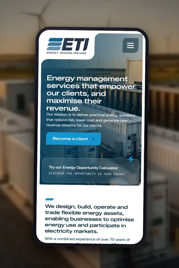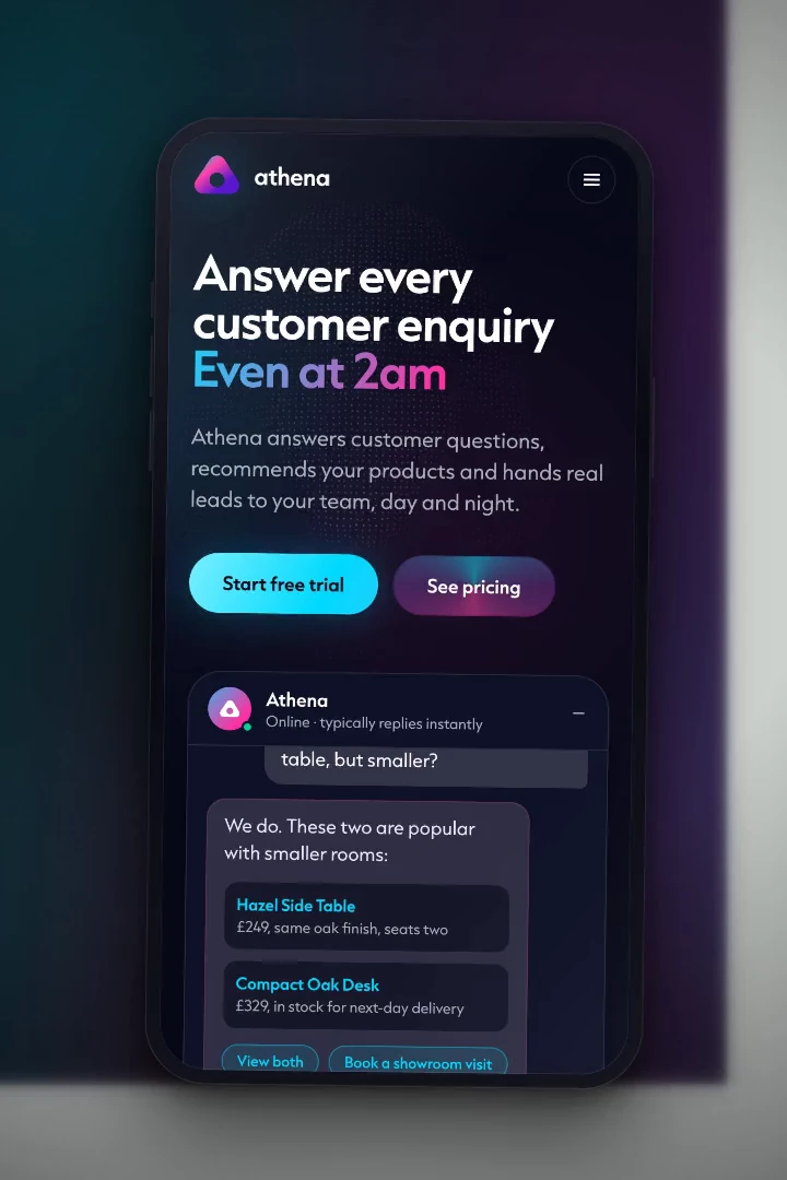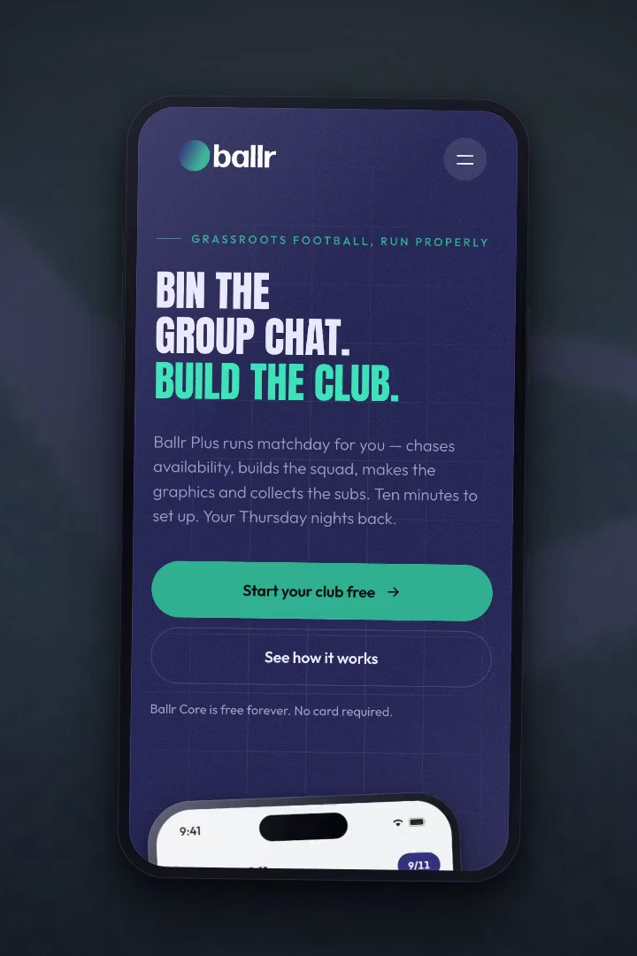
Single-page website and platform walkthrough for Richmond International
A single-page site for Richmond International, the arm of Richmond Marketing that takes FMCG brands into markets abroad and finds distributors to carry them. It is built around an interactive globe of the network and a scroll-driven walkthrough of their Richmond Edge platform, and it is quick enough to carry both.
Richmond International in numbers
The challenge: selling reach nobody can see
A distribution network is an abstract thing to sell. Nobody can picture thirty five markets.
Richmond Marketing is one of Ireland’s largest FMCG distributors. Richmond International is the part of the business that works the other way round, taking brands into markets abroad and finding the distributors to carry them there.
What they are selling is reach, and reach is invisible. A list of country names sets out the facts and conveys none of the scale, which is a problem when the whole proposition rests on the size and quality of a network somebody has to take on trust.
They were also talking to two audiences with opposite needs on the same page. A brand owner arrives looking for a route into a market. A distributor arrives looking for brands to carry. Both had to feel the site was addressed to them.
And it had a date on it. The site had to exist, and be good enough to present, for a board review.
Our approach: make the network the page
Richmond International connect brands to distributors across more than thirty five markets, and manage what happens after the introduction.
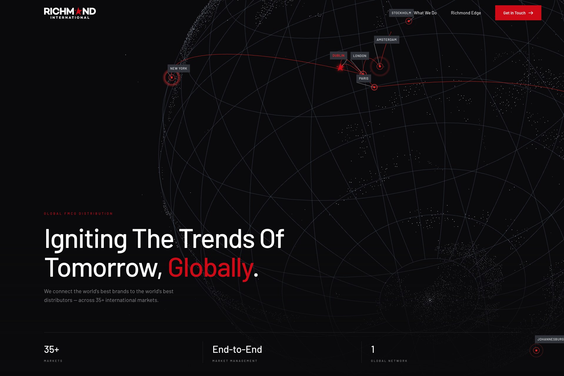
So the network is not described on this site. It is the thing you look at. The hero is a WebGL globe carrying the live network, with Dublin at its centre and routes arcing out to the markets around it. It turns on its own, and it turns under your hand if you would rather look at a particular part of the world, before finding its way back.
Their platform, Richmond Edge, is the part of the offer that separates them from a broker with a contact list. Rather than describing it, the page pins itself and steps through three screens of it as you scroll, so the platform is demonstrated instead of claimed.
The two audiences are handled where it matters, at the point of contact. The enquiry form asks which one you are, changes its questions accordingly, and the enquiry lands in the right inbox on the Richmond side.
All of that motion has a cost, and most of the work after the design was signed off went into making sure it did not land on the visitor.

What we built for Richmond International
Everything on the page is doing one of two jobs: showing the reach, or showing the platform.
The particle globe
A WebGL globe of the distribution network, eleven markets named on its face and routes tracing out from Dublin. It turns by itself, turns under the cursor, and settles back to where it started a few seconds after you let go.
The Richmond Edge walkthrough
The section pins and the laptop opens, zooms and steps through three screens of the platform as you scroll. Charts, figures and bars draw themselves in as each screen arrives, so it reads as software being used rather than a screenshot.
The distribution map
A dot map of the world, 3,488 of them, with the thirty five active markets picked out and pulsing. Dots resolve in as it comes into view. A category selector sits on top of it so alcohol, beverages, snacks, wellness and confectionery each get their own moment.
Two ways in
The enquiry form asks whether you are a brand owner or a distributor, adapts its questions, and routes to a different inbox on the Richmond side. The confirmation email is styled like the site rather than like a receipt.
Built for the phone as its own design
Mobile is not the desktop page squeezed. It follows its own layout from the design file, down to a full-height wash over the hero so the headline reads over the globe, and a version of the platform walkthrough that loops rather than depending on scroll.
Quick in spite of all of it
The 3D engine loads as its own chunk after the page is up, the typeface is self-hosted rather than fetched from Google, and every image is WebP. The critical path came down from 137KB to 38KB.

The Tech-Spec
Laravel 13 with Vue 3 on the front, compiled with Vite. The globe is Three.js, loaded on demand so it never holds up the first paint. The distribution map is drawn on canvas from a packed bitmask rather than served as an image, and the platform walkthrough is real markup being scaled and stepped through, which is why it stays sharp at any size. Enquiries go out through Mailgun.
HTML5, CSS3, JavaScript, Vue 3, Three.js, WebGL, Canvas, Vite
Laravel 13 (MVC framework), PHP 8.3
WebGL particle globe, scroll-driven product walkthrough, canvas distribution map, Mailgun, Google Analytics 4, Google Tag Manager, structured data, self-hosted webfonts

Services on this project
Most of our clients use more than one.
Bespoke websites
Designed and built from scratch around your business rather than adapted from a template. Every page and every field is there because it earns its place.
→ 02Design services
Branding, artwork and the design work that sits around a site rather than inside it.
→ 03Maintenance
Updates, backups and security handled quietly in the background, so problems are dealt with before they become urgent.
→More work
A few of the other projects we have built.